


PROJECT DETAILS
Duration — 6 weeks Type — Professional
MY ROLE
Design Research UI/UX Design Product Development Visual Design and Branding Facilitation
KEY WORDS
Design Strategy Digital Health Telemedicine New Venture Design
TEAM
1 Design Director 2 UX Designers (including myself)
(Along with client and business team stakeholders)
The Business Case
A big healthcare conglomerate was entering the Indian Digital Health space through the setup of a New in-house Venture that would offer access to their world class medical expertise online.
Research Objective
The objective of our design discovery was to understand the relevance of the value propositions to a target audience in tier 1, 2 and 3 cities in India. These findings would contribute to identify specific use cases to start off the digital service design.
Design Goal
To build an end-to-end digital healthcare ecosystem that integrated the physical service offerings of the well-connected medical ecosystem of the client across cities, specialties and doctors.

An End-to-end Digital Health Ecosystem

OVERVIEW OF THE DESIGN PROCESS
In defining the product propositions through strategic design, a large part of the design process was centered around customer discovery, defining the MVP and participatory co-creation with client stakeholders.
#1
Zero-based Research with Focus Groups
With the intention of delivering quantified experience design, the focus groups were designed to have a collective discussion on the relevance of existing health services available to the demographic we interviewed. Through this this discussion, we uncovered their values and beliefs and price sensitivity to several existing offerings. Their motivations to visit instituitions and their perception of the doctor’s role in their health was highlighted.

The research covered a target demographic of several age segments, gender, and city sizes based on the customer discovery done by the business team and the current users of key market competitors in the digital health space.


We structured the focus group discussions to understand -
Getting to know the FGD participants.
Level of acquaintance with digital health platforms.
Outlook on healthcare in terms of price-sensitivity.
Priority and Attitude towards self-diagnosing.
a. The User Scenarios
These Design Probes were presented in the context of a health or wellness related scenario to set the context of the service concepts we presented to the focus group participants. Each of the journey scenarios correspond to the initial product definitions proposed to kick off the New Venture design strategy.


b. Concepts as Design Probes
For the focus group discussions, we conceptualized the signature features of a to-be digital health ecosystem and used these feature cards as probes (prompts and triggers) to understand what value participants saw in the proposed service design.


c. Feature Voting
After each of the focus-group discussions, we asked the participants to place 5 dot-votes on a specific features and 1 vote on an overall user scenario that would improve or add value to their current needs.

We designed scenario panels to help envision a possible service offering and had participants vote on the features that felt most relevant to their need. The dot stickers denote the votes the participants put on concepts they found the most relevant to their life context and price sensitivity.
#2
Research Synthesis
The Research was synthesised not only to quantify the the dot-voting on the features by also code the insights and gather them into overall themes to inform the product definitions for the MVP. The repetition and frequency of specific insights were factored into the synthesis of t the qualitative research summary.


#3
Defining The User Experience
The research synthesis offered a bundle of potential features and customer discovery through participatory research. As we transitioned from the Discovery phase to the design phase, we started simultaneously defining a visual design system and a scalable interaction model for the minimum viable product. Throughout the development of the minimum viable product, we conducted day long workshops with internal stakeholders to detail core journeys of the experience.
a. The Taskflow and Features
The product definition and architecture was broken down into epics for agile sprints. Through co-design workshops with clients each epic was outlined and features were added to make a logical flow of actions with the business, risk, tech and operations team.

This image shows the conceptualisation of a conversation triaging of symptoms that builds a decision tree and directs you to the right doctor .

An initial version of detailed feature suggestions for the journey that allows patients to book appointments and select online appointment options. We conceptualised ideas such as “digital waiting rooms” that offer contextual health tips as a way of mitigiating long waiting times.
b. Conceptual Interaction Model

“My health ecosystem”
These conceptual models help to begin structuring the experience based on how we might approach our health and its care in a world outside the digital environment and then be inspired to structure the features of the product according to that real-world mental model.

c. Outlining Specific Use Cases
Based on the workshops and prioritisation of features, specific use cases included:
Symptom Triaging to match with the right doctor
Access to Health Records in a Digital Health Vault
Searching for specialities to get a second opinion


#4 Detailed Product Design
After building a solid foundation of understanding the feature set, we moved onto defining a brand language, visual system and taskflow architecture of the mobile product. The prioritised Product-service was the patient-side model.

The Information Architecture and Task Flow of the Minimum Viable Product
a. Visual Design System
(The visual design systems depicted here are sanitised and do not represent the true brand colors to protect the client’s identity)
We started to build the visual design system by building moodboards, a tone of voice and UI elements and color that help associate with digital healthcare.

Moodboard for Visual Design Inspiration - to communicate an approachable look and feel.

Based on quotes from our initial research, we defined brand values for the end-to-end health ecosystem, keeping in mind that the service touchpoints would be both physical and digital.

Visual and logo identity for the Doctors 24x& Mobile-first platform.
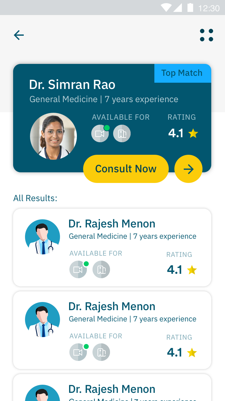
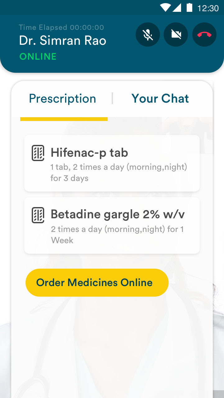
b. High fidelity screen designs
Unique screens and key user flows were designed in high fidelity to communicate the look and feel of the product and hand over for front end development. We counducted rounds of testing and feedback with healthcare service design experts and client stakeholders.


c. Clickable Prototyping
In order to test multiple visual language systems, below is a clickable prototype of a visual language, different from the previous one, to demonstrate a look and feel significantly different from the initial one, to communicate the spectrum of possibility of the tone of voice of the app. These explorations were done while the brand was still being finalised and we were exploring multiple visual design approaches.