Finding Meaningful Relationships in Data
OBJECTIVE
Allow data to show us relationships that are worth highlighting and understanding what kind of data we must have, to help answers the questions we ask.
APPROACH
By understanding the data and relationships inward, we can communicate it outward.
Visualization is about finding the right fit between the dataset and the story
DETAILS
This project was a part of the Grad Communication Design Studio at the CMU School of Design (5 weeks)

#1
Identify An Area of Research
The context of looking for researchable questions based on data was within Allegheny County and/or the City of Pittsburgh. Crime was interesting to me because of one maybe able to correlate crime rates with many environmental factors like temperature and accessibility and also infrastructural issues like street lighting. I was interested in how crimes are categorized, Within those I was interested in how the movement and activity of criminals was affected by the weather and seasons.

Initial Ideation to find a topic of interest within the context of Pittsburgh.
I STARTED WITH THIS QUESTION
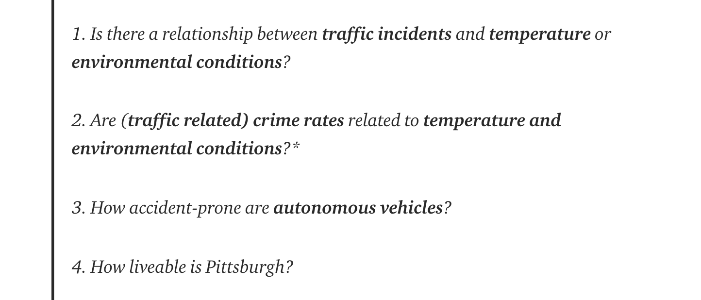
What do people try to find out about a city when they are planning to move there?
Is it affordable?
How is the weather like?
How accessible is transport?
How low are crime rates?

I have been interested in the factors that drive crime in a city. My approach in this project was to look at seemingly unrelated aspects of a city and find relationships between them. The relationship between crime and temparature was an interesting starting point
#2
Collecting Data Sources
To start answering some of the questions framed above, I started looking at sources of data about crime rates in Pittsburgh and Allegheny County. The data sources known and reliable institutions and organisations.

Data sources used. Data was of two kinds: 1. Data that sets the context and 2. Data that tells a story.
Framing Researchable Questions
Framing a question that elicited an answer beyond yes know was a way to find multiple relationships and use the data sets to find those patterns. The question I started with, after looking at articles and data available was -
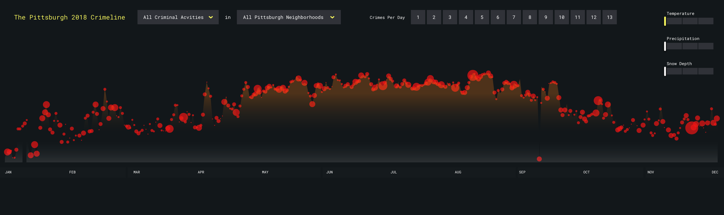
How does seasonal change affect the nature of crimes and offences committed or reported in Pittsburgh/Allegheny County?
#3
Cleaning Data Sources
Data available online is not in a usable form, and working to make it meaningful for my own researchable question was required. I cleaned weather data and arranged it by specific ranges of temparature and snow depth, to start seeing patterns. With the crime data, the strategy was to boil it down to which types of charges I should focus on.


I employed several strategies to work with the data and simplify it to find clues to one of the many researchable questions
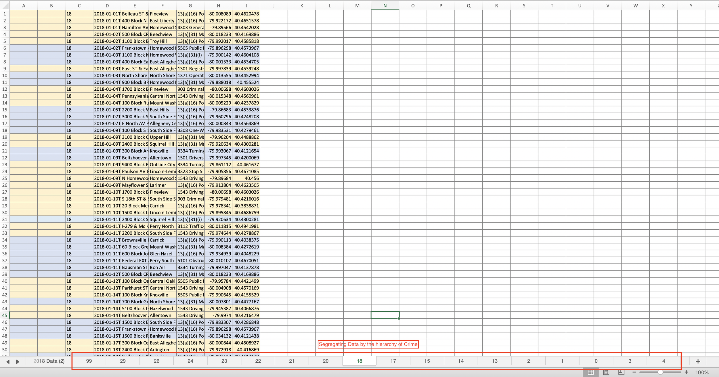
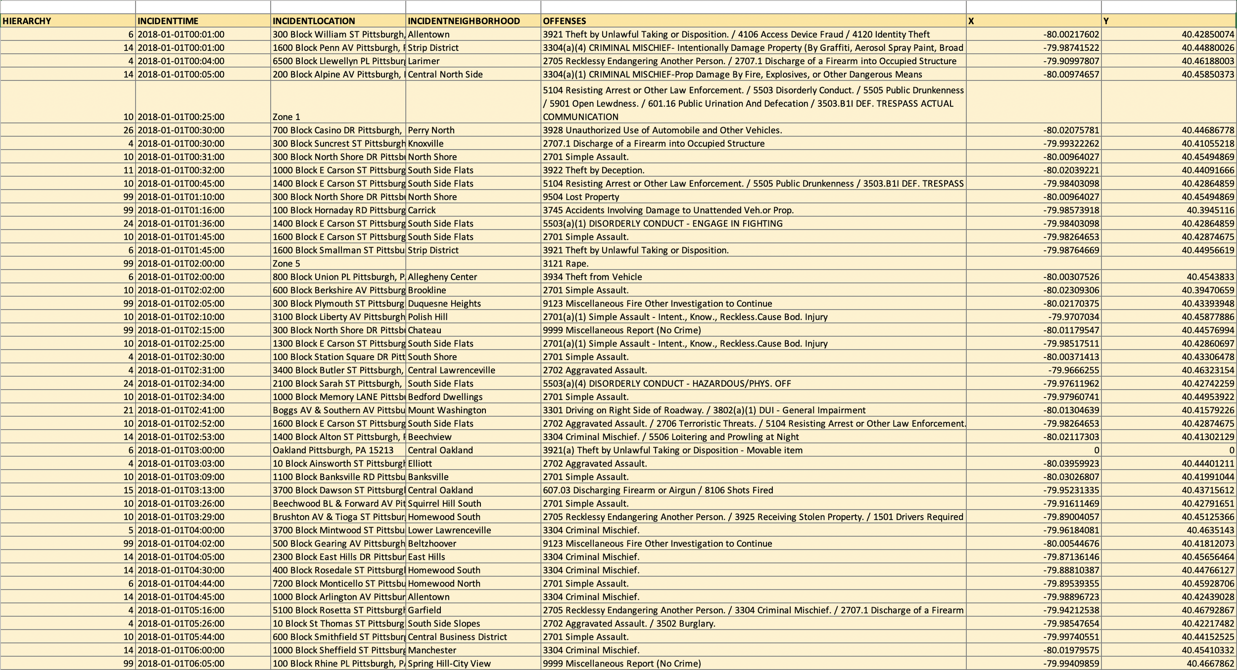
Data from Police Blotter Info on every incident of crime and its time stamp

Here I started boiling down from 14,000 rows of data to consumable chunks to start working on finding relationships and patterns. I chose to focus on criminal activity that was related to movement, that required criminals to be moving around - so I could related it better to weather info. Some crimes, like financial fraud, for example, did not fit the relationship I was trying to bring out well. So I took them out.


#4
Applying Co-ordinate Systems
Different co-ordinate systems anchored different kinds of narratives well. My narrative was primarily based on the timeline of a year and changes within that, so I chose the linear scale to start composing my interaction data visualisation. I also experimented with geo-data to plot crimes, but focussed primarily on the cartesian system.


#5
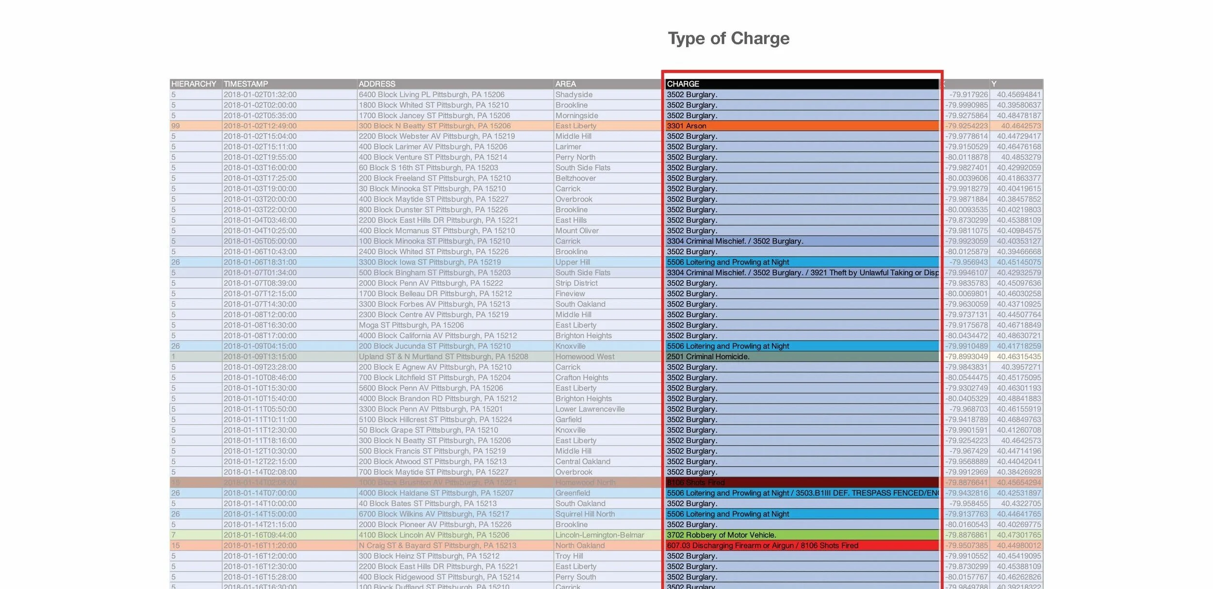
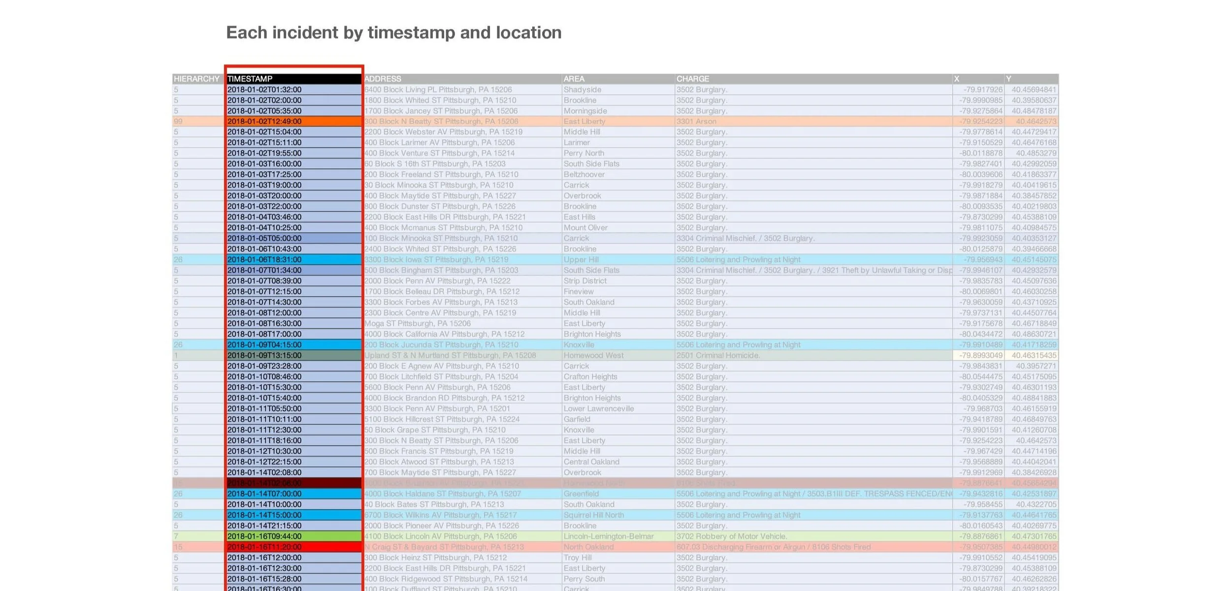
Assigning Visual Cues To Data Types
Visualization is about finding the right fit between the dataset, it’s interpretation and the geometry and colors we use. It is related to the goals you aim to achieve in your data. Visual Cues allow close cognitive connection between the data and it is represented.

The first row is the data type. The pink row shows the ranges used to represent each of the data types and the light blue denote the visual cue combinations for the set of data types to start constructing the narrative structure. Continuing this exploration gave multiple permutations to design the visualisations —


#6
Narrative Structure
Do you propose a narrative[progresses linearly] or indexical [shows and reveals information] structure? It would be a narrative structure and reveal nuances of crime through the day and seasons through interactivity.

Ways of Structuring the Narrative — The final outcome applied a combination of a forward-moving narrative structure and depth-gaining indexical structure.

Iterating on the Narrative Structure - What is the best way to construct this story?


After the first rough visualisation of the narrative and indexical structure, I used questions as prompts to define the flow of revealing information to the viewer —

#7
Interactive Visualisation
The interaction, navigation and unfolding of the patterns in data was prototyped with XD to show relationships and reveal and permute different combinations of ranges to show the relationships between the frequency of crimes, seasonal conditions and time of the year